Re: Ducks and Lanche 3rd Jerseys accidentally leaked
2the avs... initial impression is not bad. thinking the throwback is kinda cool. but, the diagonal "colorado" was fine too....
the ducks - there is no possible way they could make a "good" jersey with their logo, or frankly, their team name. they are all childish, silly, and ridiculous. way to inspire fear in your opponents.
the ducks - there is no possible way they could make a "good" jersey with their logo, or frankly, their team name. they are all childish, silly, and ridiculous. way to inspire fear in your opponents.
Re: Ducks and Lanche 3rd Jerseys accidentally leaked
3Avs look like the dumb stadium series jerseys or warmup jerseys, don't like. Ducks I do like, nice they're going back to the Mighty Duck.
Re: Ducks and Lanche 3rd Jerseys accidentally leaked
4https://www.youtube.com/watch?v=ZVJpxn7g8JMT.C. wrote:the avs... initial impression is not bad. thinking the throwback is kinda cool. but, the diagonal "colorado" was fine too....
the ducks - there is no possible way they could make a "good" jersey with their logo, or frankly, their team name. they are all childish, silly, and ridiculous. way to inspire fear in your opponents.
Re: Ducks and Lanche 3rd Jerseys accidentally leaked
5This was my initial impression.Oates2Hullie450 wrote:Avs look like the dumb stadium series jerseys or warmup jerseys, don't like. Ducks I do like, nice they're going back to the Mighty Duck.
Avs my 1st thought was "ew"
Ducks my 1st thought was "not bad"
Now now, the Canadian Government has apologized for Bryan Adams on SEVERAL occasions!
Re: Ducks and Lanche 3rd Jerseys accidentally leaked
6For reporting accuracy, there was nothing "accidental" nor "leaked" about this. Chris Smith of IceThetics published images of the two alternate jersey designs in early August: http://www.icethetics.co/blog/2015/8/11 ... on-the-way
And now, back to our regularly scheduled opinions ...
And now, back to our regularly scheduled opinions ...
Re: Ducks and Lanche 3rd Jerseys accidentally leaked
7Mine were just the opposite. Never a fan of the over-sized duck-billed goalie mask, while I appreciate the throwback sentiment of the Avs' new third.Ozzies09tc wrote:This was my initial impression.
Avs my 1st thought was "ew"
Ducks my 1st thought was "not bad"
Re: Ducks and Lanche 3rd Jerseys accidentally leaked
8Thanks. I was going off of the caption under the jerseys that TSN tweeted out that NHL shop accidentally leaked them.JMC-STL wrote:For reporting accuracy, there was nothing "accidental" nor "leaked" about this. Chris Smith of IceThetics published images of the two alternate jersey designs in early August: http://www.icethetics.co/blog/2015/8/11 ... on-the-way
And now, back to our regularly scheduled opinions ...
Re: Ducks and Lanche 3rd Jerseys accidentally leaked
9I'm old enough to remember the Colorado Rockies franchise, so I like the Avs throwback to that era. The Ducks jersey, on the other hand, makes me want to gouge my own eyes out. The only color I have seen on a sweater that is worse than this orange abomination is the Perds urine colored "gold" jerseys.
Re: Ducks and Lanche 3rd Jerseys accidentally leaked
10yes, children's movies are my go-to for hockey rage. a professional sports team should certainly latch onto that.
Re: Ducks and Lanche 3rd Jerseys accidentally leaked
11I like the Avs logo portion of the jersey, not sold on anything else about it though. Ducks is okay,
Re: Ducks and Lanche 3rd Jerseys accidentally leaked
12I was kidding with the video, but you have to remember this team was first owned by The Walt Disney Company, they were trying to promote their film franchise and make money off of a pro sports team at the same time. The way that pro team would turn out is sure to be pretty cheesy.T.C. wrote:yes, children's movies are my go-to for hockey rage. a professional sports team should certainly latch onto that.
Re: Ducks and Lanche 3rd Jerseys accidentally leaked
13Stanley Cup on their team record notwithstanding.Oates2Hullie450 wrote:... The way that pro team would turn out is sure to be pretty cheesy.
Re: Ducks and Lanche 3rd Jerseys accidentally leaked
14how that disney owns star wars and everyone has forgotten about the mighty ducks, how long until they are renamed the anaheim jedis?
Re: Ducks and Lanche 3rd Jerseys accidentally leaked
15The Ducks jersey is just too orange to manage, the logo is irrelevant. If they have an off night in those they'll actually look like pylons.
Like the old Rockies logo for the Avs, but the jersey overall is just kind of meh. Not appalling, which is more than you can say for many 3rd jerseys.
Like the old Rockies logo for the Avs, but the jersey overall is just kind of meh. Not appalling, which is more than you can say for many 3rd jerseys.
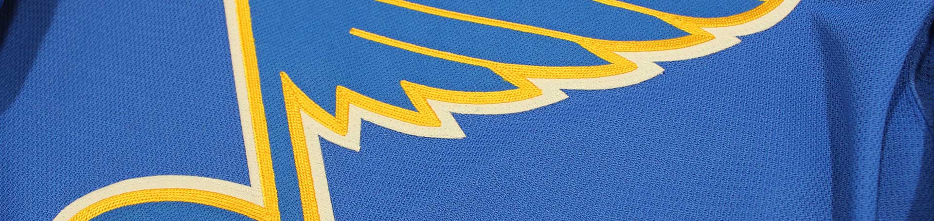
...but whatever, the Blues won the Cup!!!!!
Re: Ducks and Lanche 3rd Jerseys accidentally leaked
16Both are horrid and look like bad Halloween costumes.
Re: Ducks and Lanche 3rd Jerseys accidentally leaked
18Same here. I really like the old snow peaked mountain and official Colorado "C" logos. This is far better than that silly "swooshy", snowy "A".MissouriMook wrote:I'm old enough to remember the Colorado Rockies franchise, so I like the Avs throwback to that era.
MissouriMook wrote:The Ducks jersey, on the other hand, makes me want to gouge my own eyes out.
SAME. The Duck jerseys are horrible. That nasty black/brownish orange crap they wore the last several years was truly horrible.
I like mustard on my QT hot dogs....not on hockey jerseys.MissouriMook wrote:The only color I have seen on a sweater that is worse than this orange abomination is the Perds urine colored "gold" jerseys.
Re: Ducks and Lanche 3rd Jerseys accidentally leaked
19I do love the original Ducks logo but that might be a generational deal as I was a kid in grade school when the Mighty Ducks came into being. Hated the jade/eggplant colors, but the logo is classic. If they could just use their current jerseys with the original logo they'd have one of the better jerseys in the league.
Re: Ducks and Lanche 3rd Jerseys accidentally leaked
20Love that Ducks logo. I think it's way better than the webbed foot D thing they use as their main logo nowadays. Don't like how there is so much orange but oh well.
The Avs jersey would look great if the shoulders were maroon instead of white. Just add a white stripe like the sleeve cuffs. I get the notion of white on the "peak" of the jersey like snow, but it's just kind of weird. Love the throwback Rockies style logo regardless. They should use that instead of the swooping A. It was trendy in the 90s but it just looks bad now.
The Avs jersey would look great if the shoulders were maroon instead of white. Just add a white stripe like the sleeve cuffs. I get the notion of white on the "peak" of the jersey like snow, but it's just kind of weird. Love the throwback Rockies style logo regardless. They should use that instead of the swooping A. It was trendy in the 90s but it just looks bad now.