Ask Santa for it, when you're sitting 6 feet away from him at the mall. Be sure to speak up - these masks are making it even harder on St. Nick's centuries-old hearing loss.Dread_Pirate_Westley wrote: Tue Nov 17, 2020 7:09 amI'd buy that.JMC-STL wrote: Tue Nov 17, 2020 7:06 amA clear cultural appropriation for the sole purpose of economic profit. The jersey might as well have a "FUCK THE QUÉBÉCOIS!" banner wrapped around the hemline.Dread_Pirate_Westley wrote: Mon Nov 16, 2020 8:38 pm... But I was referring to the Avalanche 4th jersey recognizing the Nordiques. She's a beaut Clark
Re: 4th Jersey Program
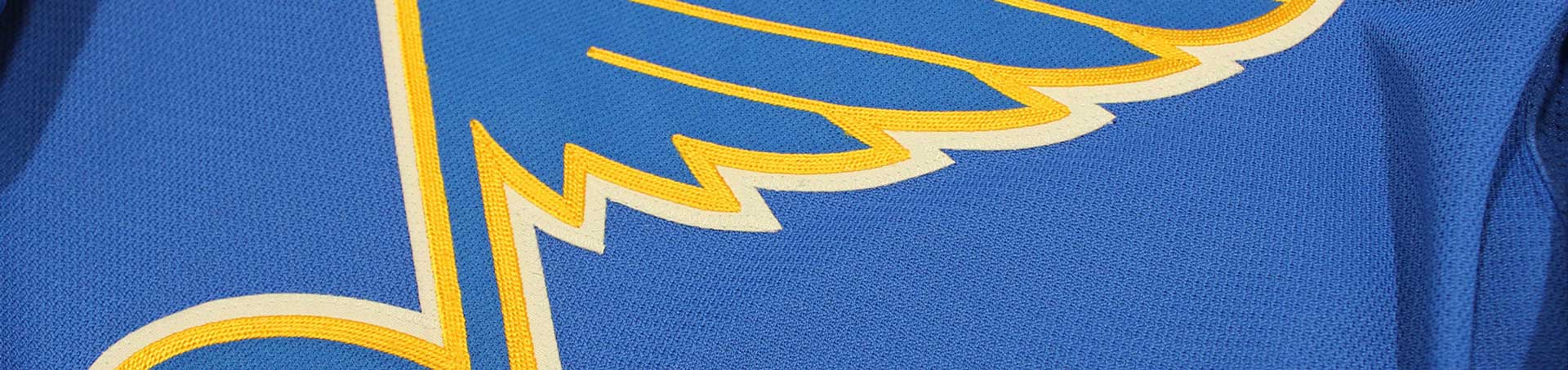
77Man, if fans hate a red Blues sweater this much, I wonder what Habs fans are saying about seeing a blue Canadians sweater. It's almost as if the entire point of these jerseys was to reverse colors 
KA-KAW!
Re: 4th Jersey Program
78Yeah, the Habs switched the Red and Blue in the universally loved jerseys they've worn for 80 years. The Blues dug up the most hated jersey in team history, the only one with red, and made it the prominent feature. It's dumb, it's ugly, and I will not rest until everyone on the internet agrees with me!MattyIce wrote: Tue Nov 17, 2020 2:14 pm Man, if fans hate a red Blues sweater this much, I wonder what Habs fans are saying about seeing a blue Canadians sweater. It's almost as if the entire point of these jerseys was to reverse colors
...but whatever, the Blues won the Cup!!!!!
Re: 4th Jersey Program
79I am prepared to die on this hill I stand.Dave's a mess wrote: Tue Nov 17, 2020 4:13 pmYeah, the Habs switched the Red and Blue in the universally loved jerseys they've worn for 80 years. The Blues dug up the most hated jersey in team history, the only one with red, and made it the prominent feature. It's dumb, it's ugly, and I will not rest until everyone on the internet agrees with me!MattyIce wrote: Tue Nov 17, 2020 2:14 pm Man, if fans hate a red Blues sweater this much, I wonder what Habs fans are saying about seeing a blue Canadians sweater. It's almost as if the entire point of these jerseys was to reverse colors
Just a Russian propaganda account
Re: 4th Jersey Program
80Dread_Pirate_Westley wrote: Mon Nov 16, 2020 4:10 pmWill you two stop ignoring the beauty of the Nordic throwbackTurk Sanderson wrote: Mon Nov 16, 2020 11:12 amYeah, Use the Blackhawk's shoulder patches, and replace the blue-note with the winged-wheel. Fuck You, Adidas!
Yeah, some of these teams came out with great jerseys. Jerseys that you hope they keep. Avs came out with one, the Wild jersey using North Star colors is awesome and the Kings blending the Gretzky era jersey with the original purple looks awesome.
Re: 4th Jersey Program
81Barclay Plager will be waiting for you on the other side.Dread_Pirate_Westley wrote: Tue Nov 17, 2020 7:54 pmI am prepared to die on this hill I stand.Dave's a mess wrote: Tue Nov 17, 2020 4:13 pmYeah, the Habs switched the Red and Blue in the universally loved jerseys they've worn for 80 years. The Blues dug up the most hated jersey in team history, the only one with red, and made it the prominent feature. It's dumb, it's ugly, and I will not rest until everyone on the internet agrees with me!MattyIce wrote: Tue Nov 17, 2020 2:14 pm Man, if fans hate a red Blues sweater this much, I wonder what Habs fans are saying about seeing a blue Canadians sweater. It's almost as if the entire point of these jerseys was to reverse colors
Re: 4th Jersey Program
82Keep up the debate, boys. It's the only trick the NHL has up its retro-reverse colored sleeve to keep restless fans engaged until January. Maybe.
Re: 4th Jersey Program
83I agree for the most part. I really like the Wild's look. I think that bright Green/Gold color scheme is outstanding and nobody uses it. I always thought the Gretzky era Kings jerseys were the best in that organization's history by a mile, and I'm surprised at how much I like them in purple/gold.BillP. wrote: Tue Nov 17, 2020 8:57 pmDread_Pirate_Westley wrote: Mon Nov 16, 2020 4:10 pmWill you two stop ignoring the beauty of the Nordic throwbackTurk Sanderson wrote: Mon Nov 16, 2020 11:12 am
Yeah, Use the Blackhawk's shoulder patches, and replace the blue-note with the winged-wheel. Fuck You, Adidas!
Yeah, some of these teams came out with great jerseys. Jerseys that you hope they keep. Avs came out with one, the Wild jersey using North Star colors is awesome and the Kings blending the Gretzky era jersey with the original purple looks awesome.
As for the Avs, they look nice, but I'm not sure how I feel about a team using the logo/design of a market they plucked a team out of and changed immediately. Same thing with the Whalers/Canes. I liked seeing the regular Whalers uniforms on throwback nights, but I'm not sure how anyone from Hartford felt about that. Obviously I just referenced the Wild using the North Stars colors as one of my favorites, but I think it's different when its a new team in the same market.
Another jersey I was really disappointed by was the Canucks:
They have such a diverse uniform history with the flying V and the Bure era skate jersey, along with a great standard color scheme. I can't believe they ended up with this 1994 indoor lacrosse style turd.
...but whatever, the Blues won the Cup!!!!!
Re: 4th Jersey Program
84People are saying Barclay came up with the design on the 4th jersey. You hear it everywhere.Turk Sanderson wrote: Wed Nov 18, 2020 12:23 amBarclay Plager will be waiting for you on the other side.Dread_Pirate_Westley wrote: Tue Nov 17, 2020 7:54 pmI am prepared to die on this hill I stand.Dave's a mess wrote: Tue Nov 17, 2020 4:13 pm
Yeah, the Habs switched the Red and Blue in the universally loved jerseys they've worn for 80 years. The Blues dug up the most hated jersey in team history, the only one with red, and made it the prominent feature. It's dumb, it's ugly, and I will not rest until everyone on the internet agrees with me!
Just a Russian propaganda account
Re: 4th Jersey Program
85I always knew it would come to this. You and I locked in internet mortal combat. Just so you know, the reason I'm smiling is I am not left handed....ah shit that's not true, I am. Please don't stab me.Dread_Pirate_Westley wrote: Tue Nov 17, 2020 7:54 pmI am prepared to die on this hill I stand.Dave's a mess wrote: Tue Nov 17, 2020 4:13 pmYeah, the Habs switched the Red and Blue in the universally loved jerseys they've worn for 80 years. The Blues dug up the most hated jersey in team history, the only one with red, and made it the prominent feature. It's dumb, it's ugly, and I will not rest until everyone on the internet agrees with me!MattyIce wrote: Tue Nov 17, 2020 2:14 pm Man, if fans hate a red Blues sweater this much, I wonder what Habs fans are saying about seeing a blue Canadians sweater. It's almost as if the entire point of these jerseys was to reverse colors
...but whatever, the Blues won the Cup!!!!!
Re: 4th Jersey Program
86I reckon you're gonna love this one then, DPW ...Dread_Pirate_Westley wrote: Mon Nov 16, 2020 4:10 pmWill you two stop ignoring the beauty of the Nordic throwbackTurk Sanderson wrote: Mon Nov 16, 2020 11:12 amYeah, Use the Blackhawk's shoulder patches, and replace the blue-note with the winged-wheel. Fuck You, Adidas!
Re: 4th Jersey Program
87Green is such an underrated color. Thats a good looking kitJMC-STL wrote: Wed Nov 18, 2020 2:45 pmI reckon you're gonna love this one then, DPW ...Dread_Pirate_Westley wrote: Mon Nov 16, 2020 4:10 pmWill you two stop ignoring the beauty of the Nordic throwbackTurk Sanderson wrote: Mon Nov 16, 2020 11:12 am
Yeah, Use the Blackhawk's shoulder patches, and replace the blue-note with the winged-wheel. Fuck You, Adidas!
Just a Russian propaganda account
Re: 4th Jersey Program
88Dave's a mess wrote: Wed Nov 18, 2020 1:22 pmI always knew it would come to this. You and I locked in internet mortal combat. Just so you know, the reason I'm smiling is I am not left handed....ah shit that's not true, I am. Please don't stab me.Dread_Pirate_Westley wrote: Tue Nov 17, 2020 7:54 pmI am prepared to die on this hill I stand.Dave's a mess wrote: Tue Nov 17, 2020 4:13 pm
Yeah, the Habs switched the Red and Blue in the universally loved jerseys they've worn for 80 years. The Blues dug up the most hated jersey in team history, the only one with red, and made it the prominent feature. It's dumb, it's ugly, and I will not rest until everyone on the internet agrees with me!
Just a Russian propaganda account
Re: 4th Jersey Program
89FIFYDread_Pirate_Westley wrote: Mon Nov 16, 2020 4:10 pm People with style will buy the jersey. People without style wont
I love it, and part of it honestly is that so many hate it...makes me love it even more
#BluesRebelForRedJerseys
"Do Only Good Everyday"
Re: 4th Jersey Program
90What’s with that serpent? I do not understand that Canuck logo and what it stands for or means for that matter. wish they would get rid of it.Dave's a mess wrote: Wed Nov 18, 2020 10:02 amI agree for the most part. I really like the Wild's look. I think that bright Green/Gold color scheme is outstanding and nobody uses it. I always thought the Gretzky era Kings jerseys were the best in that organization's history by a mile, and I'm surprised at how much I like them in purple/gold.BillP. wrote: Tue Nov 17, 2020 8:57 pmDread_Pirate_Westley wrote: Mon Nov 16, 2020 4:10 pm
Will you two stop ignoring the beauty of the Nordic throwback
Yeah, some of these teams came out with great jerseys. Jerseys that you hope they keep. Avs came out with one, the Wild jersey using North Star colors is awesome and the Kings blending the Gretzky era jersey with the original purple looks awesome.
As for the Avs, they look nice, but I'm not sure how I feel about a team using the logo/design of a market they plucked a team out of and changed immediately. Same thing with the Whalers/Canes. I liked seeing the regular Whalers uniforms on throwback nights, but I'm not sure how anyone from Hartford felt about that. Obviously I just referenced the Wild using the North Stars colors as one of my favorites, but I think it's different when its a new team in the same market.
Another jersey I was really disappointed by was the Canucks:
They have such a diverse uniform history with the flying V and the Bure era skate jersey, along with a great standard color scheme. I can't believe they ended up with this 1994 indoor lacrosse style turd.
Re: 4th Jersey Program
91BillP. wrote: Wed Nov 18, 2020 8:42 pmWhat’s with that serpent? I do not understand that Canuck logo and what it stands for or means for that matter. wish they would get rid of it.Dave's a mess wrote: Wed Nov 18, 2020 10:02 amI agree for the most part. I really like the Wild's look. I think that bright Green/Gold color scheme is outstanding and nobody uses it. I always thought the Gretzky era Kings jerseys were the best in that organization's history by a mile, and I'm surprised at how much I like them in purple/gold.BillP. wrote: Tue Nov 17, 2020 8:57 pm
Yeah, some of these teams came out with great jerseys. Jerseys that you hope they keep. Avs came out with one, the Wild jersey using North Star colors is awesome and the Kings blending the Gretzky era jersey with the original purple looks awesome.
As for the Avs, they look nice, but I'm not sure how I feel about a team using the logo/design of a market they plucked a team out of and changed immediately. Same thing with the Whalers/Canes. I liked seeing the regular Whalers uniforms on throwback nights, but I'm not sure how anyone from Hartford felt about that. Obviously I just referenced the Wild using the North Stars colors as one of my favorites, but I think it's different when its a new team in the same market.
Another jersey I was really disappointed by was the Canucks:
They have such a diverse uniform history with the flying V and the Bure era skate jersey, along with a great standard color scheme. I can't believe they ended up with this 1994 indoor lacrosse style turd.
???? Are you talking about the Orca (Killer Whale)...which live widely throughout the Pacific Northwest? Never seen "Free Willy" I suppose
More info here: https://thecanuckway.com/2019/10/25/van ... onic-logo/
"Do Only Good Everyday"
Re: 4th Jersey Program
92Is that what it’s supposed to be? Still though, they’re the Canucks. I mean if the Blues added something to the note or veered from it, it would be bad. JMObradleygt89 wrote: Wed Nov 18, 2020 9:39 pmBillP. wrote: Wed Nov 18, 2020 8:42 pmWhat’s with that serpent? I do not understand that Canuck logo and what it stands for or means for that matter. wish they would get rid of it.Dave's a mess wrote: Wed Nov 18, 2020 10:02 am
I agree for the most part. I really like the Wild's look. I think that bright Green/Gold color scheme is outstanding and nobody uses it. I always thought the Gretzky era Kings jerseys were the best in that organization's history by a mile, and I'm surprised at how much I like them in purple/gold.
As for the Avs, they look nice, but I'm not sure how I feel about a team using the logo/design of a market they plucked a team out of and changed immediately. Same thing with the Whalers/Canes. I liked seeing the regular Whalers uniforms on throwback nights, but I'm not sure how anyone from Hartford felt about that. Obviously I just referenced the Wild using the North Stars colors as one of my favorites, but I think it's different when its a new team in the same market.
Another jersey I was really disappointed by was the Canucks:
They have such a diverse uniform history with the flying V and the Bure era skate jersey, along with a great standard color scheme. I can't believe they ended up with this 1994 indoor lacrosse style turd.
???? Are you talking about the Orca (Killer Whale)...which live widely throughout the Pacific Northwest? Never seen "Free Willy" I suppose
More info here: https://thecanuckway.com/2019/10/25/van ... onic-logo/
Re: 4th Jersey Program
93Oh yeah, thanks for educating me on thatbradleygt89 wrote: Wed Nov 18, 2020 9:39 pmBillP. wrote: Wed Nov 18, 2020 8:42 pmWhat’s with that serpent? I do not understand that Canuck logo and what it stands for or means for that matter. wish they would get rid of it.Dave's a mess wrote: Wed Nov 18, 2020 10:02 am
I agree for the most part. I really like the Wild's look. I think that bright Green/Gold color scheme is outstanding and nobody uses it. I always thought the Gretzky era Kings jerseys were the best in that organization's history by a mile, and I'm surprised at how much I like them in purple/gold.
As for the Avs, they look nice, but I'm not sure how I feel about a team using the logo/design of a market they plucked a team out of and changed immediately. Same thing with the Whalers/Canes. I liked seeing the regular Whalers uniforms on throwback nights, but I'm not sure how anyone from Hartford felt about that. Obviously I just referenced the Wild using the North Stars colors as one of my favorites, but I think it's different when its a new team in the same market.
Another jersey I was really disappointed by was the Canucks:
They have such a diverse uniform history with the flying V and the Bure era skate jersey, along with a great standard color scheme. I can't believe they ended up with this 1994 indoor lacrosse style turd.
???? Are you talking about the Orca (Killer Whale)...which live widely throughout the Pacific Northwest? Never seen "Free Willy" I suppose
More info here: https://thecanuckway.com/2019/10/25/van ... onic-logo/
Re: 4th Jersey Program
94I would rather see a serpent on the Blues jersey rather than the color red.
Re: 4th Jersey Program
95Give the serpent a trombone and you might really be on to something.BluesSK wrote: Thu Nov 19, 2020 7:32 pm I would rather see a serpent on the Blues jersey rather than the color red.
...but whatever, the Blues won the Cup!!!!!
Re: 4th Jersey Program
96I assume they wanted to make sure they had a logo that dives everyday before Kesler showed up.bradleygt89 wrote: Wed Nov 18, 2020 9:39 pmBillP. wrote: Wed Nov 18, 2020 8:42 pmWhat’s with that serpent? I do not understand that Canuck logo and what it stands for or means for that matter. wish they would get rid of it.Dave's a mess wrote: Wed Nov 18, 2020 10:02 am
I agree for the most part. I really like the Wild's look. I think that bright Green/Gold color scheme is outstanding and nobody uses it. I always thought the Gretzky era Kings jerseys were the best in that organization's history by a mile, and I'm surprised at how much I like them in purple/gold.
As for the Avs, they look nice, but I'm not sure how I feel about a team using the logo/design of a market they plucked a team out of and changed immediately. Same thing with the Whalers/Canes. I liked seeing the regular Whalers uniforms on throwback nights, but I'm not sure how anyone from Hartford felt about that. Obviously I just referenced the Wild using the North Stars colors as one of my favorites, but I think it's different when its a new team in the same market.
Another jersey I was really disappointed by was the Canucks:
They have such a diverse uniform history with the flying V and the Bure era skate jersey, along with a great standard color scheme. I can't believe they ended up with this 1994 indoor lacrosse style turd.
???? Are you talking about the Orca (Killer Whale)...which live widely throughout the Pacific Northwest? Never seen "Free Willy" I suppose
More info here: https://thecanuckway.com/2019/10/25/van ... onic-logo/
...but whatever, the Blues won the Cup!!!!!
Re: 4th Jersey Program
97Just look how excited Sammy is about the new look! 
...but whatever, the Blues won the Cup!!!!!
Re: 4th Jersey Program
98Sammy looks like he just got caught smoking weed before 4th period and is trying to hide it while looking nonchalant
Just a Russian propaganda account
Re: 4th Jersey Program
99Sammy's having a Jim Ahern moment.Dread_Pirate_Westley wrote: Fri Nov 20, 2020 4:45 pmSammy looks like he just got caught smoking weed before 4th period and is trying to hide it while looking nonchalant