I agree and I don't like the cream at the bottom of the blue one either.NHLTIM wrote: Wed May 20, 2020 10:23 am Not of fan of the white one at all , or the two alternate jerseys
Re: Best Blues Jersey
51...but whatever, the Blues won the Cup!!!!!
I agree and I don't like the cream at the bottom of the blue one either.NHLTIM wrote: Wed May 20, 2020 10:23 am Not of fan of the white one at all , or the two alternate jerseys
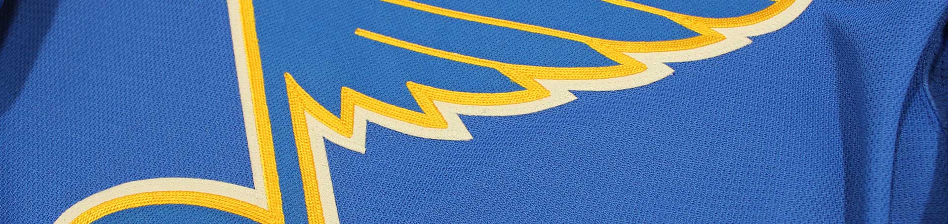
NHLTIM wrote: Wed May 20, 2020 12:39 pm It just doesn’t get any better than this for the home jersey.039B55EA-4CE0-444F-B08D-A6CE7B88BE6B.jpeg
Yep. Agree 100%MissouriMook wrote: Wed May 20, 2020 9:57 amThe two on the left are OK, but the two on the right need to be fired into the sun immediately along with whoever designed them. I don't understand why people insist on trying to change the look of our jerseys by adding "flair" with stripes and excess color. The whole appeal of our jerseys over the years have been their simplicity around the greatest logo in all of professional sports. Leave it alone and use things like our current 3rd, the WC Alumni jerseys, or pretty much anything from 1967-1984. The wordmark "BLUES" and clown jerseys were too overdone and take too much away from the thing that makes our jerseys great - the Bluenote.MattyIce wrote: Wed May 20, 2020 7:13 am I check out a website called Icethetics everyday. They post NHL uniform concepts daily. Today was a Blues concept. This is pretty much exactly what I wish the team would look like. Not sure how I feel about that yellow sweater. The design is cool, but it's too Preds-like. The rest are great. Check it out:
https://www.icethetics.com/concepts/blu ... -the-years
jerseys.png
Sure is isn't it? Love that shot. The Blues during the Sutter/Federko era were so damn lovable. Especially under Demers.
Agreed.NHLTIM wrote: Wed May 20, 2020 12:39 pm It just doesn’t get any better than this for the home jersey.039B55EA-4CE0-444F-B08D-A6CE7B88BE6B.jpeg